The UCOVI Blog
The UCOVI Blog
COVID-19 Mortality Rates - refining media claims with basic statistics
Ned Stratton: 10th May 2020
Commentary on COVID-19 and the UK government's handling of it rightly dominates the airwaves and, to butcher a common English saying, it's raining stats and dogs. Claims and counterclaims about death tolls, death rates, the R rate, flattening the curve, blah blah blah.
In his element right now is LBC's James O'Brien. "We are the worst in the whole of Europe" was his take on the pandemic
earlier this week.
I listen to his show from my makeshift office/bedroom most mornings; I like it mostly and he isn't the only broadcaster making sweeping statements using singular stats that represent a bit of the truth but not all of it.
From his shows this week, I think the average listener would take away the following:
- The UK government's response has been incompetent and cynical.
- This has led us to having the worst death rate/death toll in Europe.
- Because of this, we're some kind of global 'how not to respond to a pandemic' pin-up.
I use "death rate/death toll" in point two deliberately. O'Brien uses them interchangeably, which is a bit naughty, and his LBC colleague Maajid Nawad used his slot yesterday to highlight this.
It's naughty because they're different things, and although the UK does have the highest death toll in Europe, it doesn't have the highest death rate per population – it has the 4th highest. The rate per population is the relevant one for evaluating the government's performance, so conflating the UK's toll (which is the worst in Europe) with its rate per population (which isn't the worst but, annoyingly for James O'Brien, is the more powerful stat) is a kind of "sorry, not sorry/whoops I meant toll not rate but I said rate, silly me" way to use statistics liberally to advance a narrative about how we're coping especially badly.
Exit stage left, James O'Brien, because we can use some fairly accessible statistical concepts to evaluate definitively whether the UK's COVID mortality rate is especially high in the global context.
First, it would be helpful to present the latest data.*


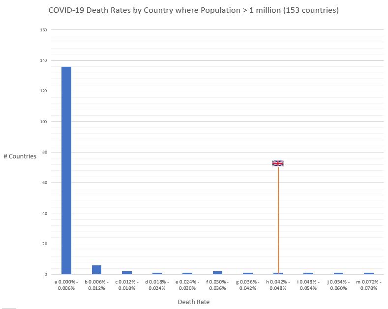
Above is a histogram showing mortality rates in the 153 countries in the world with population greater than 1 million people.
On the x-axis, we have COVID death rate per population in 13 buckets with intervals of 0.006%, lowest on the left (0% to 0.006%) and highest (0.072% to 0.078%) on the right. On the y-axis is the number of countries in each bucket.
The UK is in bucket H with a mortality rate of 0.0465%. (The three above us are Italy, Spain and Belgium in that order.)
In this positively-skewed distribution, the vast majority of countries are in bucket A, with less than 0.006%, many of them recording no fatalities at all.
It makes the UK and the other 16 countries in buckets B to M appear as significant outliers – so on the face of it we are doing very badly.
But let's consider two things.
First, this is a human-to-human transmitted virus that began in one country and arrived in others by means of international travel. It therefore heavily penalises frequently visited countries and their neighbours (ie mainland Europe), and is perhaps less of a threat to countries that are more remote economically, geographically or as tourist destinations (Madagascar, for example, which has recorded no deaths and a mere 193 cases of infection in a population of 26 million).
The second issue is data-quality. Put simply, can we trust the diagnostics and case reporting from countries with low or zero deaths? (Nate Silver describes this problem in the context of the 2009 swine flu pandemic in The Signal and the Noise.)
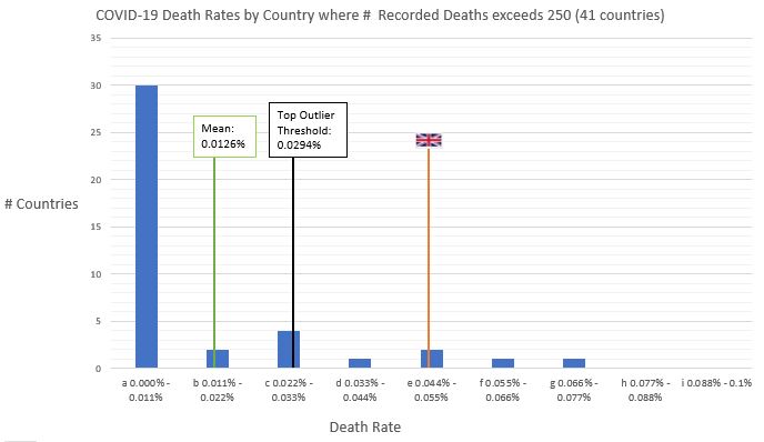
There's a lot of noise to suppress in bucket A. This is a bit crude, but let's do so by discounting countries with less than 250 reported deaths. This leaves with us 41 countries, and eyeballing the data, they're mostly populous, economically integrated, and/or close to the original point of outbreak, which is what we want to see. It leaves us with the histogram below.


This one has 9 buckets with intervals of 0.011% each†, with the UK in bucket E (0.044% to 0.055%) along with Italy.
The data is still very positively-skewed (though not as severely as before). It looks like the majority of affected countries have kept their rate below 0.01% so far, making the UK's rate – and that of the 3 countries with higher rates – look significantly worse than average.
But can we statistically say that we have done "significantly worse"?
We can calculate the upper and lower thresholds of outliers within this dataset and see if the UK is beyond the upper threshold.
This calculation can be done using something called the Interquartile Range Rule (which sounds a bit maths-y but it's covered early on in 'Statistics for Dummies', so I'm not expecting a Nobel prize for this…). Doing this produces 0.0294% as the base threshold for outliers at the higher end of this dataset of 41 countries. So any country with a mortality rate higher than 0.0294% is an outlier, and that includes ourselves, Italy, Belgium, Spain, Netherlands, France and notably Sweden, who did things quite differently but evidently to the same avail.
As we're in this group of six outliers, it can be said that COVID's affect on the UK (and by popular inference, our response to it) has been significantly worse than that majority group of affected countries – so from a statistical standpoint we're not all that far from James O'Brien.
Why we have been significantly worse off is the subject of an entirely different article, and probably an independent inquiry.
*The data is accurate as of yesterday, 9th May 2020.
You can download my workings as an Excel spreadsheet, including links to sources, here.
†A good, rough-and-ready way to decide the number of buckets in which to group a numerical variable or measurement is to take the square root of the number of data-points/samples and round up to the nearest whole number. Consider taking the cube-root for larger datasets.