Data Viz Gallery
UCOVI's array of dashboards below showcase what you get when you combine Microsoft Power BI on a free subscription with openly available datasets.

The Power-BI-s have it (2024 updated)
Textual analysis in Power BI of Prime Minister's Questions debates since 1997.

Tax Havens and the money they hide (2024)
Luxembourg might well let in 6 goals every time they play football, but they've also let in a groovy $22 trillion of tax-dodgers' wonga.


What moves the dial on human progress? (2023)
World Data Visualization Prize entry (concept: Dashboard of the Present Future)


Where Do Data Analysts End Up? (2022)
Using Plotly's Sankey diagram to visualise career options post-data analytics.


Timeline of a pandemic online (2021)
UK Google searches about the Coronavirus pandemic Jan 2020 to present.
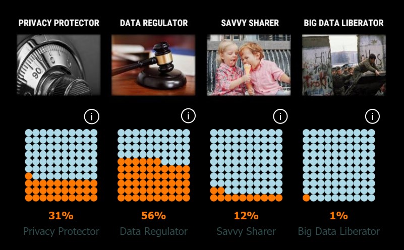
The UCOVI Political Spectrum of Data: Survey Response Analysis
In 2020 UCOVI asked people to rate themselves as Data Protectors, Regulators, Sharers or Liberators.

Structured data = Successful dates? (2020)
Tinder Trends from UCOVI founder Ned Stratton's dating history 2013-2018.

A Human Right to Business Intelligence? (2020)
An interactive dashboard for global adoption of UN Human Rights and Peacekeeping International Treaties