The UCOVI Blog
The UCOVI Blog
No code data tools: the complexity placebo
Ned Stratton: 17th March 2023
"The best bit about No Code is the little box where you can put the Code" @onejasonknight
"'no code' is actually short for 'no coder willing to support you when your sh*t breaks'" @sethrosen
These one-liners I picked out from my Twitter feed should give readers a clear impression of whether, as a data analyst, I like or dislike No Code. On a purely emotional level, the thing I like most about data analytics is the coding bit. Nothing beats a good regex, recursive CTE, DAX expression, or even a while loop that's not accidentally infinite. Take that away and you're just left with the occasional satisfaction of a working and visually appealing dashboard (admittedly nice), and "joy" of "driving business decisions by presenting insights to senior management" (even more occasional).
But I promise this won't be a rant. No Code hasn't been conceived as a buzzword, concept and fully-fledged software industry of canvas drag-and-drop tools solely for my annoyance. Its intended twin purposes are to speed up the turnaround of insights and applications and to democratise data. These are both worthwhile aims, and we need to look dispassionately at what No Code does and does not do to achieves them.
The anatomy of a No Code data tool
The Max Verstappen of the No Code paddock is probably Alteryx. Omniscope (Visokio), Dataiku, Data360Analyze (Precisely) and several others sit further back on the grid hoping to score points and get the occasional podium. What they all have in common are three things: a canvas, nodes, and connectors.
Their aim is to allow a data engineer/analyst to go from raw data from a CRM or flat files to business-stakeholder-requested numbers in the space of one computer screen (the canvas).
The nodes (attractive circle or square icons) represent a dataset at a specific stage, whether that's freshly extracted from source ("connector" nodes), blended with another dataset on the canvas (often called "join" nodes), enriched with calculated fields, or aggregated into counts/sums/averages by a category column in the data.
The connectors are arrowed lines from one node to another node. These join the source data to the intermediate datasets to the results left to right, and introduce the concepts of each node having inputs and an output, and that it's the node's task to successfully build the output using the inputs. If the node succeeds, it will usually light up with a green tick. If it fails, a naughty red cross.
In theory this all adds up to the image below from Alteryx's community page – a neat flow from source-system data to digestible statistics via clear, auditable processing steps that emphasize points of failure.


Even better, the output of each individual step/node is available as a row and column set that can be downloaded as a file, eyeballed for accuracy or further analyzed/processed on the canvas using more nodes.
The equivalent of doing this using code (for arguments sake SQL and PowerShell), would be a data warehouse server. Powershell scripts would call any API data or connect to source systems and check for latest increments of data not loaded, and send them onto warehouse staging tables. SQL stored procedures would then check the staging data for quality, and do additional transformations to send the data on to main fact, dim or report-specific base data tables to keep the warehouse updated. Individual analysts could then run ad hoc SQL scripts to read cuts of the data for specific analysis requests, projects or investigations.
The spirit of No Code
The drawbacks of the SQL warehouse arrangement which no code tools solve a priori are time-to-insight and transparency.
Good fact/dim warehouses need meticulous architectural design and substantial labour to test that the ingestion of data from source systems works accurately on an incremental basis (it being unworkable to load in the whole production database every night). Once an initial design and load process is in place, the need to ingest new sources of business data constantly crops up and stretches the ability of the initial design to adapt to them. It takes time for data engineers or DBAs to fold the new datasets into the warehouse design without breaking things. Insight gathering being downstream of this, business stakeholders are made to wait to see what's in the new data that most excites them.
With Alteryx, it's faster and in principle just needs credentials and passwords. Connect to all the raw sources you need and wait for them to load into the canvas, filter, blend and aggregate them, and you have the stats. All design, storage, and process faff around data warehouses is bypassed.
The transparency benefit of no code is even more powerful. Errors and inaccuracies in the SQL environment are not naughty red crosses. They are single lines of code among 1000s in store procedure definitions that can be debugged by analysts or developers with good SQL and experience of the dataset they are working on, but not many else. The SQL Server Management Studio/MySQL Workbench folder-structure view of database, tables, views and procedures also does not lend itself to an intuitive understanding of the start-to-finish flow of data across systems which data analysts and curious business stakeholders want to grasp. An Alteryx or Data360Analyze canvas should in theory make this instantly accessible, and obviate the need for written documentation.
As such, the paradigm of the new No Code data era we're in is that data can be analysed straight from source as soon as it is available, and in a fashion that presents the transformations and logical steps applied to the data in a simplified visual flow diagram. Errors are easy to spot and management has confidence that it knows what's going on.
We've been here before
It's important to remember though that No Code data tools such as Alteryx and Snowflake aren't introducing anything fundamentally new or ground-breaking. Rather they are faster and more appealing reincarnations of two old hits from the noughties: SQL Server Integration Services (SSIS) and Microsoft Access.
SSIS was the original Microsoft drag-and-drop dataflow canvas builder to collect flat-file source data, modify it to conform to target schemata, and load to data warehouses (ETL). As a relative SQL newbie a few years ago I thought SSIS was another quiver in my bow. I was soon corrected on this by SQL DBAs who considered SSIS packages fiddly, annoying, and poor substitutes for stored procedures and SQL Server Agent jobs. They'd built successful, decade-long careers as data engineers without touching SSIS.
Donn Felker's Youtube video on No Code from 2021 puts Microsoft Access under the spotlight as another back-to-the-future no code database solution, and in doing so highlights the big constraint of no code applications (lack of advanced customisation) and their rightful place in the data cycle (concept proving). No code makes first iterations of data solutions faster to build and easier to understand. But the more popular a solution becomes, the more stakeholders ask for additional extras from it. It is at this point that an advanced analyst or developer needs to be called on to – as @onejasonknight says in the first intro tweet – "use the little box where you put the code".
The placebo effect
In many modern businesses, no code technologies are dragged kicking and screaming out of their proof-of-concept comfort zones. Seen as the replacement for inflexible, code-heavy data warehouses, they become the foundations of entire data strategies and workflows and the great hope for simplicity and real-time insights.
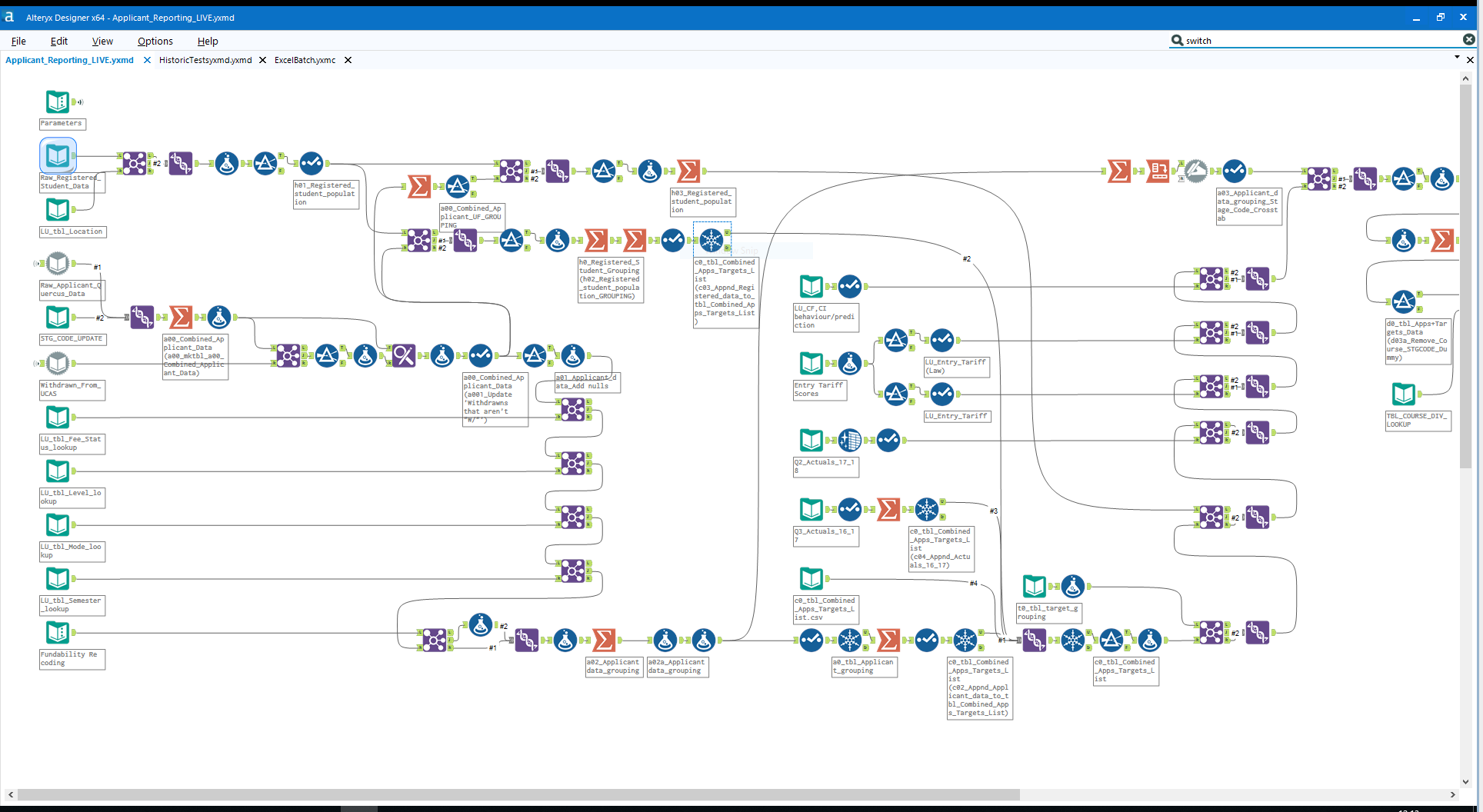
No code tools are marketed as a medicines for opaqueness and complexity. But they are instead placebos, not eradicating the complexity but re-packaging it out of long scripts and into imagery. This imagery – for any sophisticated solution – can quickly morph from the pretty, organised exemplar on Alteryx's community page into a sprawling spaghetti junction of additional chains of nodes added on for further analysis.
Observant readers will notice two additional things about the Alteryx community image further up. One, the iconography of the different node types is often not obvious and needs learning as much as SQL or Python does. Two, the image has a horizontal scroll bar – a tacit admission that often a whole solution can't be understood on a canvas. Furthermore, the transition nodes are often custom code boxes, but now they are disguised as innocent looking gift-wrapped trinkets of technical debt.
The verdict
No code has been tried before. Now as was the case then, it just begets actual code. It offers quicker EDA of new datasets and the ability to prove concepts, but is not reliable as a whole ETL solution (though possible as part of one), and is no substitute for proper modelling and normalisation. Any smart business should accept the need for complex code and the people who write it, and judge no code tools on their security and performance, not their potential to make things easier and skip documentation.
When I was moving on to my next position after 18 months of using a no code tool to build reports and analytics, it took a 10,000-word handover document to transfer my knowledge of what lurked behind the jolly orange circles on my canvasses.
⌚ Back to Latest Post