The UCOVI Blog
The UCOVI Blog
How the UK broadcast media have misreported the data on COVID-19
Ned Stratton: 7th October 2020
After eight months of Coronavirus, the initial panic and bewilderment from March/April - along with the macabre novelty of lockdown life – has been taken over by a less shocking but more persistent and eerie sense of COVID as a constant, severe threat that justifies the equally severe restrictions to social life and economic activity that supposedly protect us from it.
Here are four fun facts about COVID-Britain in October 2020:
- The national debt has increased by £227 billion to over £2 trillion.
- Concerts, theatres, trade shows and sports events have all been empty for the past 7 months and are likely to be empty for the foreseeable future.
- Out-of work-benefits claims have risen 120% since March.
- It is now against the law to congregate socially in groups of more than six people, both in public places and on private property, including among families. This means that if a couple have three children and two of them wish to invite their partners over for the weekend, the third child will legally have to spend the weekend in a Travelodge. (This is based on one true story I've heard – but just to be clear specifically staying in Travelodge is not a legal requirement.)
These are not the knock-on effects of a bad economic cycle, global banking crisis or military coup against Boris; this is directly from government action. We have chosen to do this. What's more, this action is thought by two thirds of us not to be enough.
You would think that the real or imagined alternative to this would have to be pretty horrendous. This is where the UK broadcast media and the way it presents statistics around Coronavirus come in.
How the data should be presented
To weigh the severity of COVID-19 against the harshness of the restrictions we are living under, we should in my opinion focus on these three metrics:
| Metric | Reason for tracking |
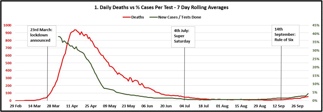
| 1. Daily COVID-19 deaths (7-day rolling average) vs Daily positive cases/tests completed (7-day rolling average) | Weighing the number of positive cases each day by how many tests are being done gives us an acceptable top-level measure of infection rates within the UK. Tracking this against daily deaths on a timeline then gives visibility on the impact of increased infection rates on the number of deaths occurring, which is important because our aim is to minimise excess lives lost through COVID-19 where feasible. Using seven-day rolling averages of both shows the trends more clearly. |
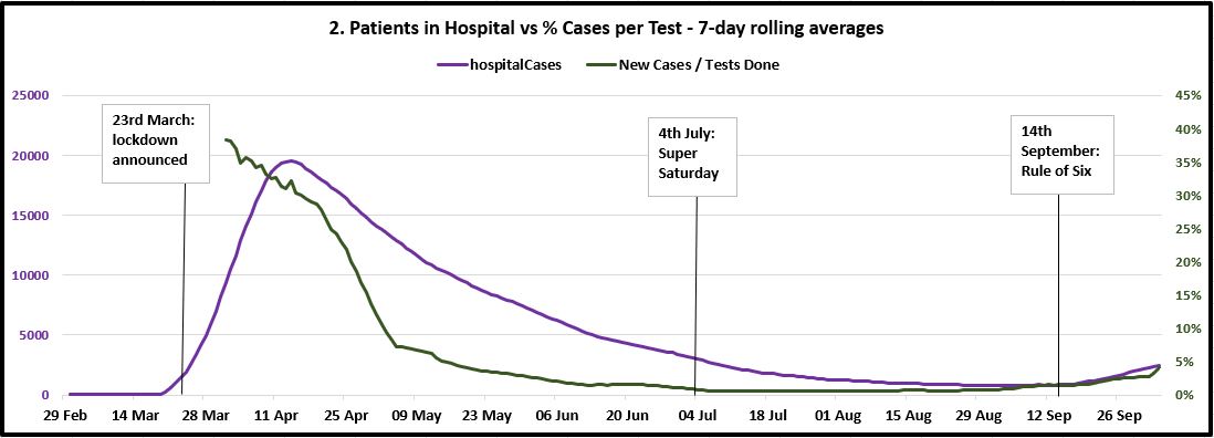
| 2. Number of COVID-19 patients in hospital (7-day rolling average) vs Daily positive cases/tests completed (7-day rolling average) | Similar to the first metric, but applied to daily numbers in hospital instead of deaths. Important because we need visibility over how COVID-19 impacts the capacity of the NHS, considering that there is a finite resource of hospital beds (114,000 in England excluding maternity and mental health), and therefore the sharper the increase of COVID-19 patients, the harder it is for the NHS to cope and prevent other seriously ill patients contracting it as well. |
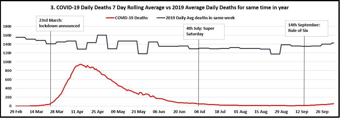
| 3. Daily COVID-19 deaths (7-day rolling average) vs average UK daily deaths as a whole from the same week in 2019 | It is important to show deaths from COVID-19 in the context of total number of deaths at the same time of a "normal" year not impacted by a global health pandemic. This is to understand whether it significantly adds to the expected mortality rate of the UK, and therefore how much it increases the likelihood of death from a base level of around 1400 people per day in a 67 million population (0.002%). |
Below are three timelines for each metric. They go from 29th February 2020 to the end of last week (4th October 2020), with milestones for when lockdown was announced, when it was lifted on "Super Saturday", and when the Rule of Six came in mid-September. (Where there is more than one Y-axis, they are colour-coded to match the lines.) This includes the additional 12,000 positive cases missed over the previous week that were added to the tally on Sunday following the PHE Excel glitch. Thankfully, this is precisely what the 7-day rolling average is designed to account for.
My observations from these charts are as follows:
- The number of positive cases discovered measured against the number of tests being done was more or less flat since the end of June to two weeks ago, when it started to increase again, though slowly and nowhere near exponentially. The Rule of Six decision on 14th September seems to be a panicked reaction to increased raw case numbers, given that the infection rate had been flat for two months.
- Since mid-June, the 7-day rolling average of daily deaths has followed exactly the infection rate weighted by tests carried out. Though curving-up slightly, deaths look a long way off increasing to the same level as the peak over April and early May.
- Furthermore, the third chart shows that since July, the COVID-19 daily deaths trend correlates with the total deaths in the UK that happened at the same time in 2019. Based on the 2019 data from October to December, I predict this will continue to be the case regardless of what restrictions are in place.
- The third chart also shows that since we passed the peak, deaths from COVID have been for the most part less than 10% of the total number of deaths that happen anyway at the time of year. This is where people are coming from when they say things like "COVID is the 23rd biggest killer in the UK today%quot;, and it shows that even if deaths crept up to 200 per day (the Vallance/Whitty doomsday scenario), this would only be a 14% increase on the expected UK mortality rate for this time of year (around 1400 per day). All deaths are sad, but in a population of 67 million these numbers hardly represent likely impending death for anyone who leaves the house.
- The purple line in chart two does show hospitalisations picking up at a quicker rate over the past 10-14 days, and the government would have cause for legitimate concern over this in the context of winter pressures on the NHS. But again, we are nowhere near the stats for April/May. Furthermore, the quick mobilisation of the Nightingale hospitals that was shown to be possible, along with discoveries of additional treatments for COVID such as dexamethasone, should count in our favour in keeping this in check.
I am not claiming for one second to have produced an advanced statistical analysis of the pandemic. Nor that there's nothing to worry about, that we should stop social distancing immediately, throw away our facemasks, or just wipe our hands on our trousers before a good firm handshake.
However, I believe the line charts at least set COVID in proper context, so that we can better measure the damage we are doing to our own lives, livelihoods, relationships and mental health against the actual seriousness of the threat it poses or is likely to pose.
I also believe this represents a step up from the job being done by our broadcast media.
How the data is presented
The coverage of COVID data from our mainstream broadcast media has been a sour cocktail of garish flashing raw numbers on deaths and cases blended with confusing, irrelevant, and woefully unchallenged Government statistical analyses.
The most watched has been on the BBC, with 20 million viewers per week at the height of the pandemic. The 5pm briefings took place entirely on the Government's terms, almost as deferentially as the type of "What would you like to talk about now, minister?" political interview you would expect to see in the 1950s. No matter how repetitive or irrelevant the presentation that day (Grant Shapps even used the briefing to announce how many road works had been completed during lockdown), the BBC seldom cut short the statements to provide independent commentary. Their principal editorial contribution has been the hazard-sign black-on-yellow rolling numbers announcing new deaths and confirmed cases, keeping these raw, contextless numbers in the forefront of viewers' minds.
Supine, insightless coverage is one thing, but the apocaplytic scaremongering that Sky News has served to its circa 10 million weekly viewers is quite another. Not content with rolling infection counts in radioactive yellow, they have gone one step further with the permanent fixture of sci-fi "Virus Pandemic: Global Emergency" wallpaper to celebrate the news story of a lifetime. This 17-second snippet of coverage from August (when case and mortality numbers were at their lowest) is a perfect illustration of this.

The relentless use by the BBC, Sky and other broadcasters of raw numbers of deaths and infections set against dramatised aesthetics has had the effect of scaring us into submission to ongoing restrictions long after the peak has passed. We are never given the context of how the daily count of deaths from COVID compares against expected deaths for the time of year, or what the daily new cases are as a proportion of those tested. Without this, we cannot place its prevalence and lethality in perspective or critically evaluate the necessity of social restrictions and whole-industry shutdowns. Taking numbers out of context in this way is akin to a weather report screaming "It will be minus 20 tomorrow!", opting not to disclose that it will be minus 20 in Antarctica.
Why the data is presented this way
The broadcasters do this knowingly, and not through lack of resource. The open letter from Professors Sikora, Heneghan and Gupta shows that there is ample credible expertise out there to challenge government science. Official stats on testing performance, hospital bed occupancy, and recorded cases are made publicly available on the GOV.UK website in an open and timely way. Nobody is hiding the data from Sky News and thereby constraining them to the raw numbers. I believe two things explain the slanted coverage:
Fear as a driver of news
Hackneyed as it is, the saying that "fear sells newspapers" applies especially acutely to diseases. I invite readers to have a look at infographic designer David McCandless's Mountains out of Molehills visualisation, which charts media inflamed news-stories from the past 20 years by intensity of coverage. The highest peaks are bird flu, swine flu, Ebola, and Zika virus. McCandless explained in a talk he gave in 2018 how the "invisible and yukky" nature of infectious diseases lends itself to media hysteria and popular anxiety. The Sky News background behind Mark Austin would seem to have its roots in this.
This government of cruel Eton Toffs
Entwined with this is the tension between the broadcast media and the Conservative Party in government. For the past forty years, the Tories' Achilles heel has been the NHS and the perception that they secretly want to privatise healthcare. Aware of this, Boris Johnson and Matt Hancock knew that it would be especially bad PR if the health service were seen to be unable to cope with a sudden influx of COVID patients. This was the trigger in March for lockdown, the reduction of "non-essential" NHS services, and a disastrously ill-fated decision on care homes.
With NHS hospital capacity in mind, patients were discharged into care homes without being tested, causing a deadly spread of the virus among a vulnerable demographic. What followed has been a hugely damaging negative feedback loop. The government's defensive handling of the situation has egged the media on to attack them purely on the grounds of cynical negligence in failing to prevent excess deaths, rather than scrutinising the efficacy of lockdowns. In turn, the government has tried desperately to save face by being seen to prevent deaths at any cost, even attempting to deflect blame onto the youth population for spreading it through reckless partying. This more than anything explains the daily drumbeat of death statistics, the failure of dissenting scientific opinion to get a hearing, and the reason we don't think to analyse COVID data properly.
The role of data in rescuing us from this
Somehow I don't see Sky News and the Beeb ditching their rolling death stats in favour of the weighted metrics I advocate anytime soon. Instead, our escape from endless lockdown and COVID-mania may be through bad data practice, not good. The Vallance-Whitty data viz of doom that guesstimated 50,000 cases per day will turn out to be the catalyst of scepticism towards the science behind the current policy, while the revelation that world-beating Track and Trace runs off Excel 2003 seriously discredits the execution of it. If further compounded, such gaffes could see the moral authority of the government to impose curfews, lockdowns and redundancies on its own people dwindle as exponentially as the rise in cases predicted by Chris Whitty's graph.
But seriously, what do we do?
The government should plan and set policy not counting on a vaccine, and prioritise opening things up where possible instead of closing them, starting with the hospitality industry, travel, events, and tradeshows. Crucially, testing should be as much about quality as quantity. The British Medical Journal says Moonshot testing by the tens of millions per day is unfeasible. So while building capacity and improving result turnaround as much as possible, we need to redirect the focus of our testing strategy away from identifying anyone who thinks they may have symptoms, and towards frequent and convenient testing for vulnerable groups and those who come into contact with them. This means health workers and carers, but equally allocating tests for members of the public, symptomatic or not, who wish to see elderly relatives. If someone has a persistent cough and loss of taste, of course they should self-isolate and seek the medical attention they need, but where is the value in them rubber-stamping the obvious fact they have COVID? Or Imperial College NHS Trust sending out tests to random members of the public as part of research studies?
We should be saving this resource for people who are not displaying symptoms of COVID, but making plans to see vulnerable relatives and wanting to confirm that they are not asymptomatic carriers first. Any sensible, caring person with possible COVID symptoms (or, for that matter, flu symptoms) would stay away from their vulnerable relative anyway, and we should start trusting that most people are like this.
The data source for my metric timelines was https://coronavirus.data.gov.uk/ - defining tests done per day as Pillar 1 (PCR testing in PHE labs and NHS hopsitals) + Pillar 2 (PCR testing for the wide population). These two pillars cover testing for new infections. Pillars 3 and 4 refer to antibody testing.
⌚ Back to Latest Post